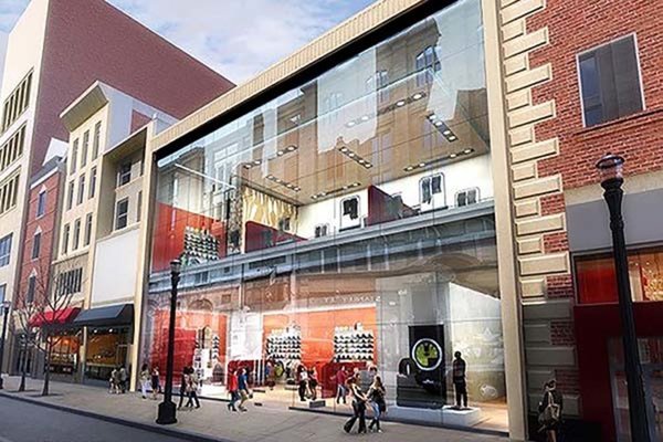
Former Kresge’s Store in Center City Being Restored to Art Deco Glory

A building that once housed a thriving five-and-dime store in Center City is having its Art Deco facade restored by its new owner. The former Kresge’s building on the 1500 block of Chestnut Street was once one of many five-and-dime stores to serve the consumers of downtown Philadelphia. This type of shop, which was bigger than a druggist’s but smaller than a department store, sold all manner of household items. Its heyday came to an end with the advent of “big box” stores like K-Mart (and, today, Target and Walmart). These stores – Woolworth’s, Kresge’s, and W.T. Grant were all competitors along Market and Chestnut Streets in the pre-war era – boasted discount prices and one-stop shopping.

Before discovering the Kresge’s building’s Art Deco design under decades of awkward additions and renovations, its new owner was planning a starkly different, thoroughly modern design.
Unlike today’s stores, Kresge’s didn’t have a template for its stores, meaning that each individual one looked different. The Center City outlet was a beauty. Art Deco in style, it boasted an elaborate facade crafted by Silverman & Levy, two Penn architecture grads who were. known for their commercial architecture. As per the Philadelphia Inquirer: “the composition borrows design elements from [Art Deco movie] theaters to give the store its drama. The limestone facade is scored with deep horizontal grooves on the upper floor that contrast with an array of flat, vertical columns and sporty, machine-age metal fins. Kresge’s original sign, which was accented with racy silver bars, added another horizontal band. The architects also marked the entrance to the second floor with an elongated, vertical transom.”
The store has been clumsily transformed over the years, split into two storefronts and has had unsightly security and practical-based additions. It would have stayed that way had PH Retail, its new owner, not discovered archive photographs of the Kresge’s store when it was first built. The company decided that, for Buffalo Exchange, its new tenant, the store would be restored to its original design. Not every detail has been recreated, but enough of the design was redone so that the new store pays tribute to the old.


