W.T.Philly – General Fug Roundup
Sometimes ugly doesn’t need an additional classification. I’ve been doing a lot of theme weeks on Mondays to fill out What The Philly, but today I think we’re going to go back to the basics.
First up on the block – a sweet little Spring Garden 2/1. As it just so happens, this is the “1” in the equation. I’ll give you a moment to take it all in.
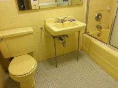
I could say so many inappropriate things about the color of this bathroom, but I’ll conscientiously abstain. Ew.
This bathroom should have been demo’d about twenty years ago. C’mon, someone buy this place and put Satan’s Little Water Closet out of its misery, please.
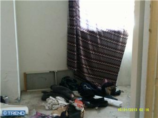
Next contender – a home with enough damage to put the “crack” back in “crack dealer,” as in the apparent former resident(s) of this charming abode.
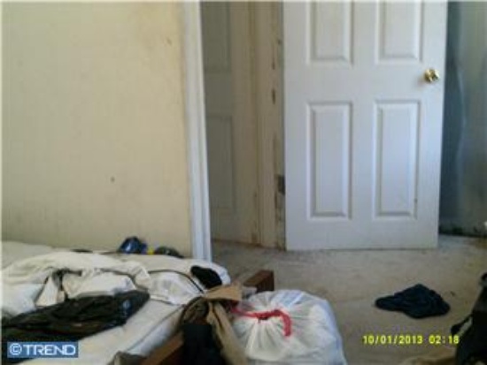
Bare mattress, trash bags, stained walls… if this picture were of the scratch n’ sniff variety, it would be redolent of eau d’felony.
But wait, there’s more!
Dirty, busted-up, and covered with trash and debris of questionable provenance? No awesome NoLibs address in Philly is going to counteract all those amenities.
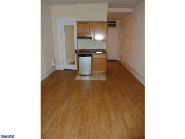
Our next home will, on first glance, wondering what is actually wrong. The place looks okay, right?
Here’s the thing. This studio is all of 319 “cozy” square feet, and that full-on picture of it is buried in TWENTY.FOUR.PICTURES of the building in which it’s located. Hey, look, I’m all about the Avenue of the Arts too, bro. But this picture in a real estate listing…?
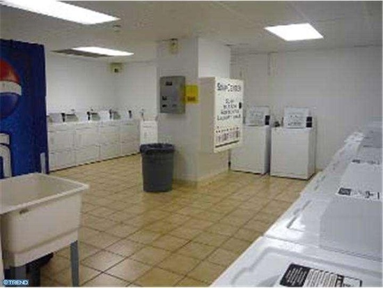
I personally make all my living decisions on the basis of the laundry room’s appearance. What, you don’t?
It’s pushing things. Just sayin’.
I don’t even know what to say about this right here? This home also has location going for it – it’s a hop, skip, and jump from Rittenhouse Square – but God almighty, someone made an architectural boo-boo with the shape of the structure. You see, there’s this ridiculous corner built into the side of the house, taking up stupid space, ensuring nothing fits in it, and looking asinine.
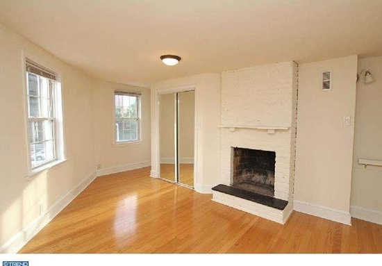
Who thought this corner was a good idea, seriously? It’s just a nook of wasted space, which is a mortal sin in Center City.
Oh, look, they built the kitchen into the corner. WHY?
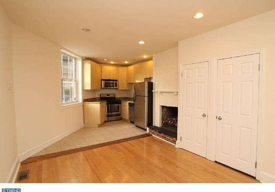
Gotta love that stove shoved in The World’s Least Convenient Corner (TM) with the awkward countertops – oughta make cooking dinner a breeze!
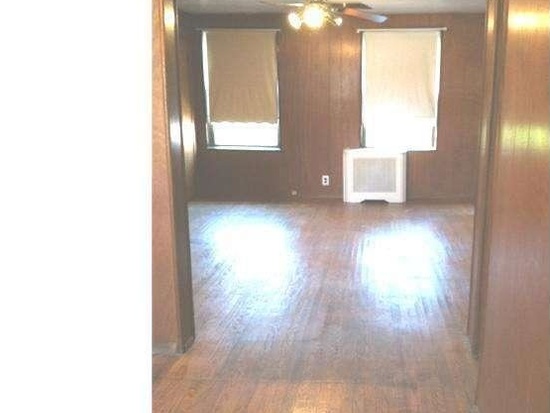
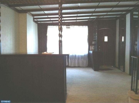
And now, friends, we have my personal winner for Center City Uggo of the Week. This little Bella Vista beaut may have, in fact, been “well maintained” as the ad states, but man, it certainly was not updated.
Had I seen this listing last week, it would have rounded out my collection of dark and dreary hovels. So dim, much wood, very need for antidepressants. Wow.
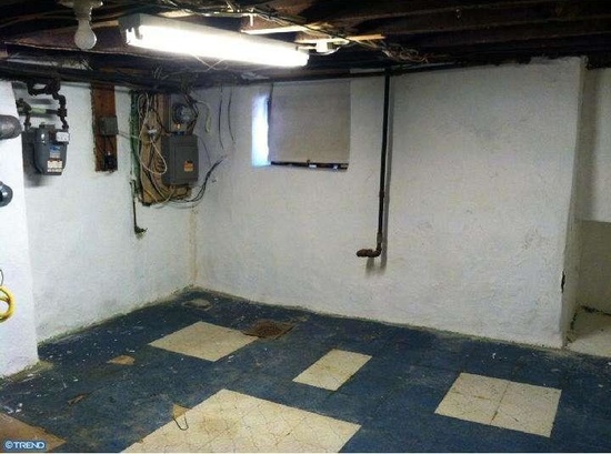
And then, as the pièce de résistance, we have the basement. Why you would show this picture in an endeavor to sell a house is beyond me, quite frankly, but someone thought it was a good idea. Some people also think torture porn is haute cinema, but some people aren’t me.

